ESPN
Brand Identity
*Promax Spark Awards 2021 Gold
Instructor: Ming Tai
Individual Project
Programs: Illustrator, InDesign, After Effects, and Photoshop.
Rebrand Strategy
ESPN is an American based global cable and satellite network channel that covers 24 hours of sports, live broadcast games, sports highlights, talk shows, and documentaries.
Sports is a universal language that connect people all over the world. The media’s representation of sports contributes negatively towards gender stereotypes and focuses on the obsession of masculinity rather than the sports itself.
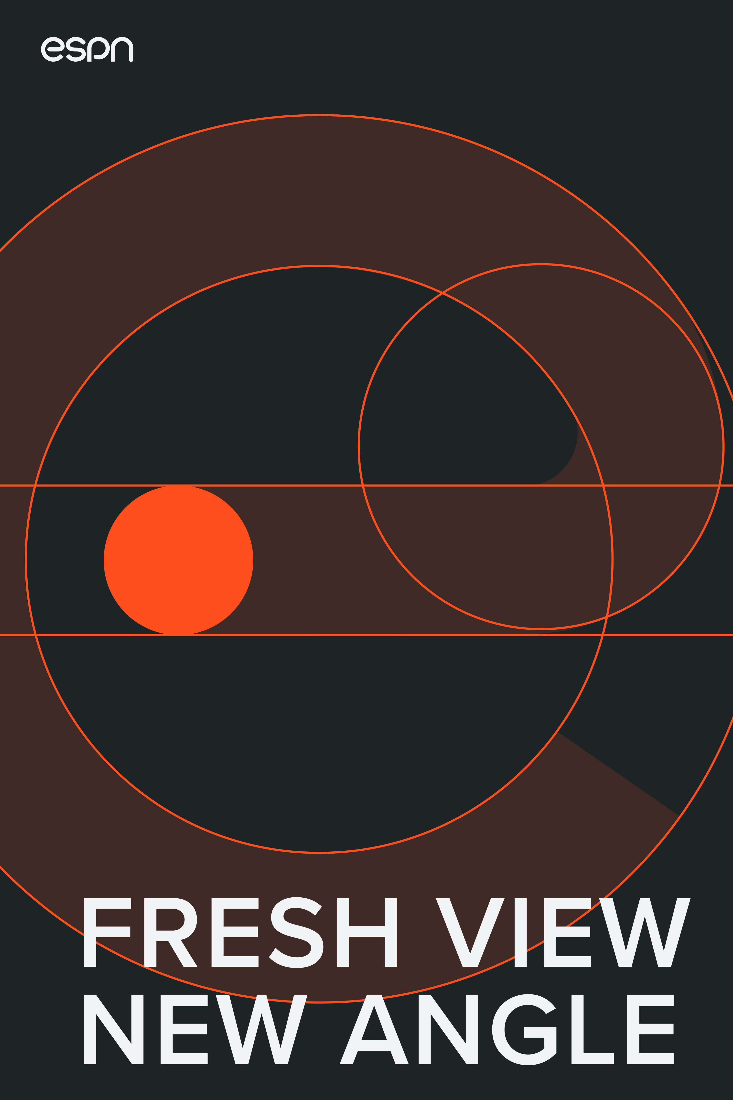
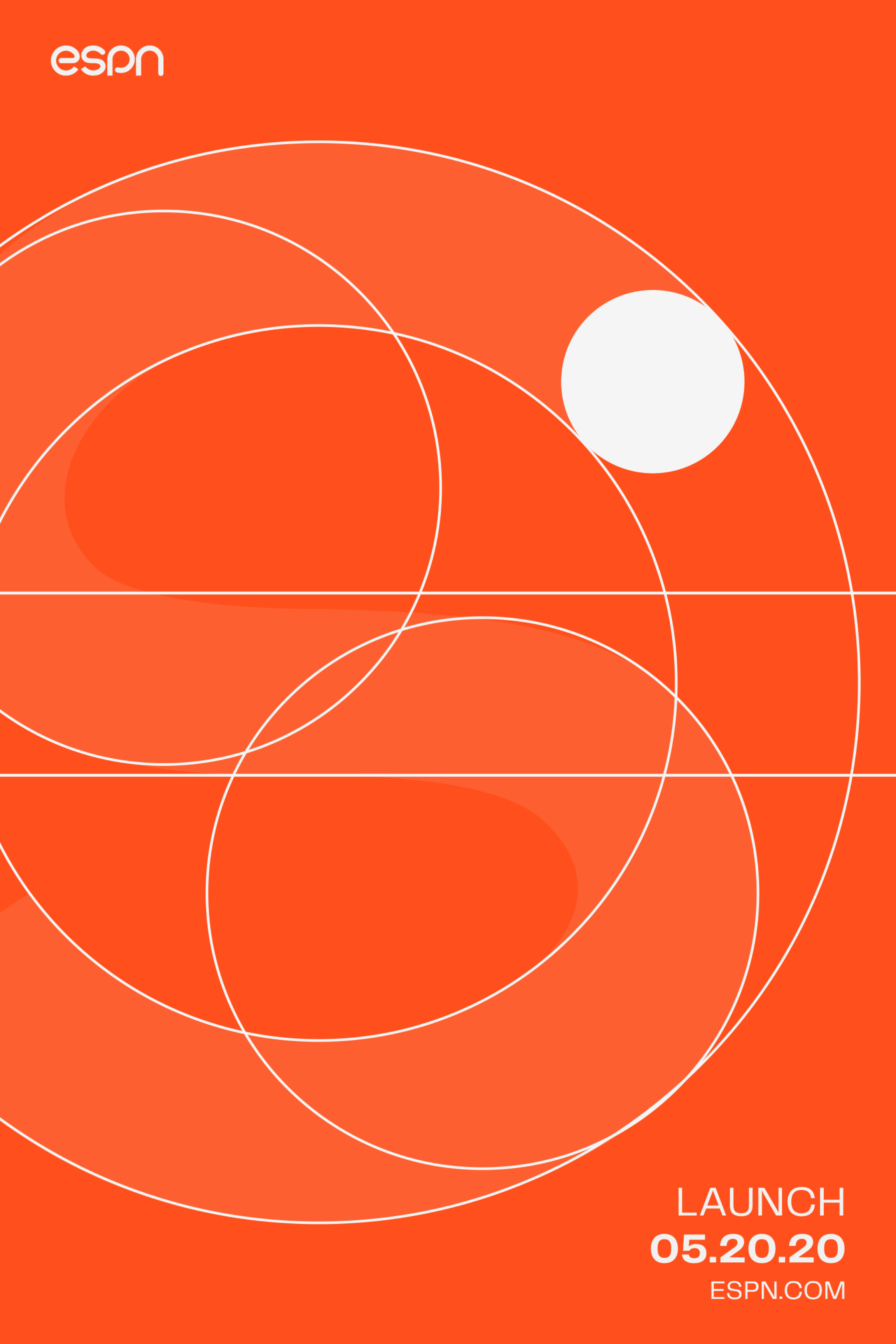
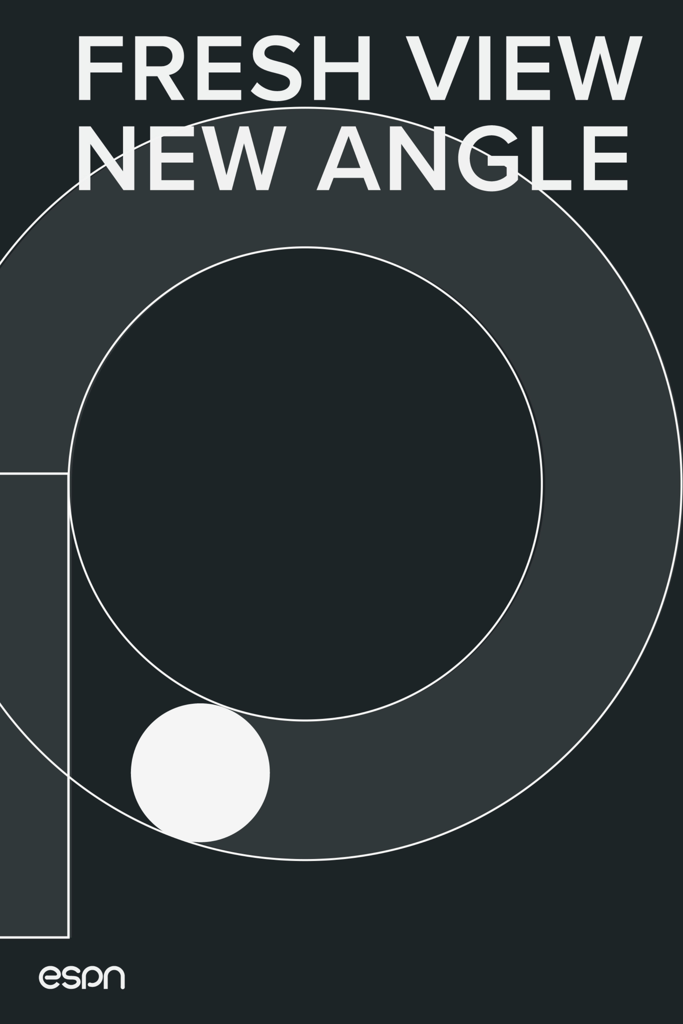
This rebrand provides a core language of all sports with a new perspective and angle for future generations.
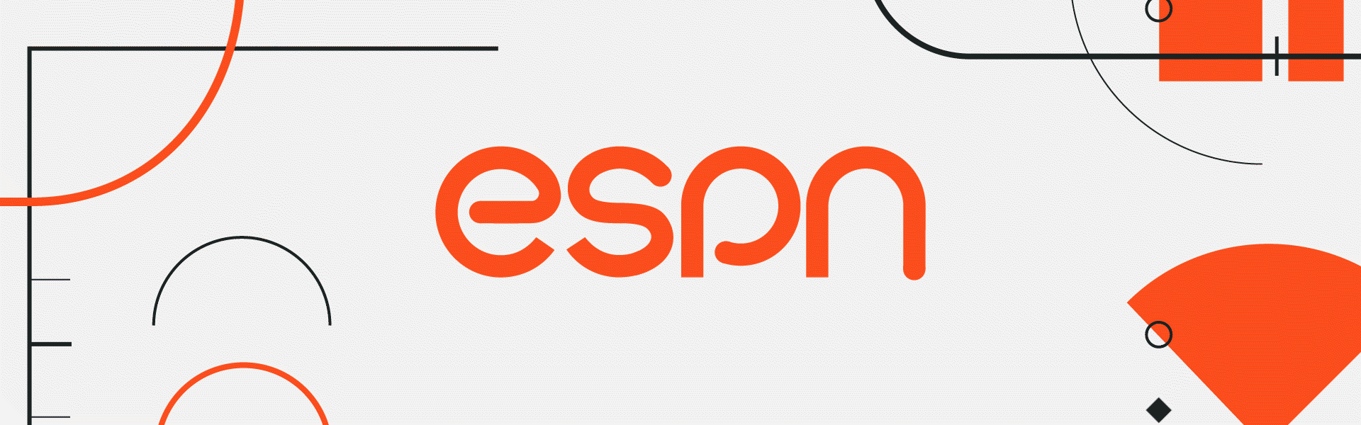
The universal language of sports is a circle. A circle implies an idea of movement, inclusiveness, and focus. The logo starts with a straight edge and ends with a circle. Like sports, the logo represents constant activeness and strives for completion.
With the idea of focusing on the fundamental elements of sports, ESPN is bringing a fresh view and new angle to sports.
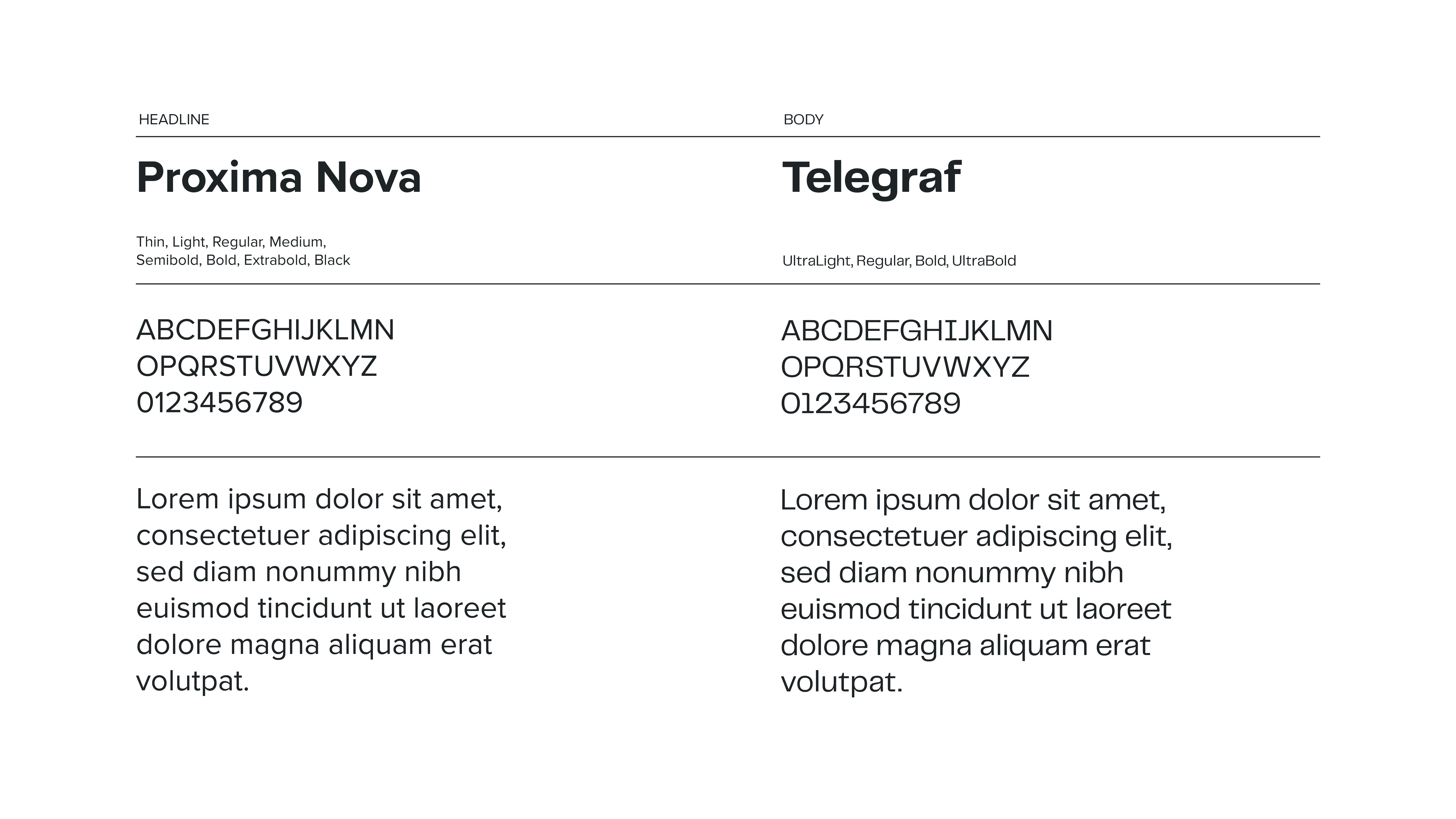
Brand Color and Typography
ESPN’s new signature Vivid Red represents the energy, drive, and passion of sports.
Similar to the ESPN logo form, Proxima Nova combines modern with a geometric appearance. In contrast to the geometric shapes, Telegraf is rectangular and linear like the abstract shapes that form the rules and lines of different sports.
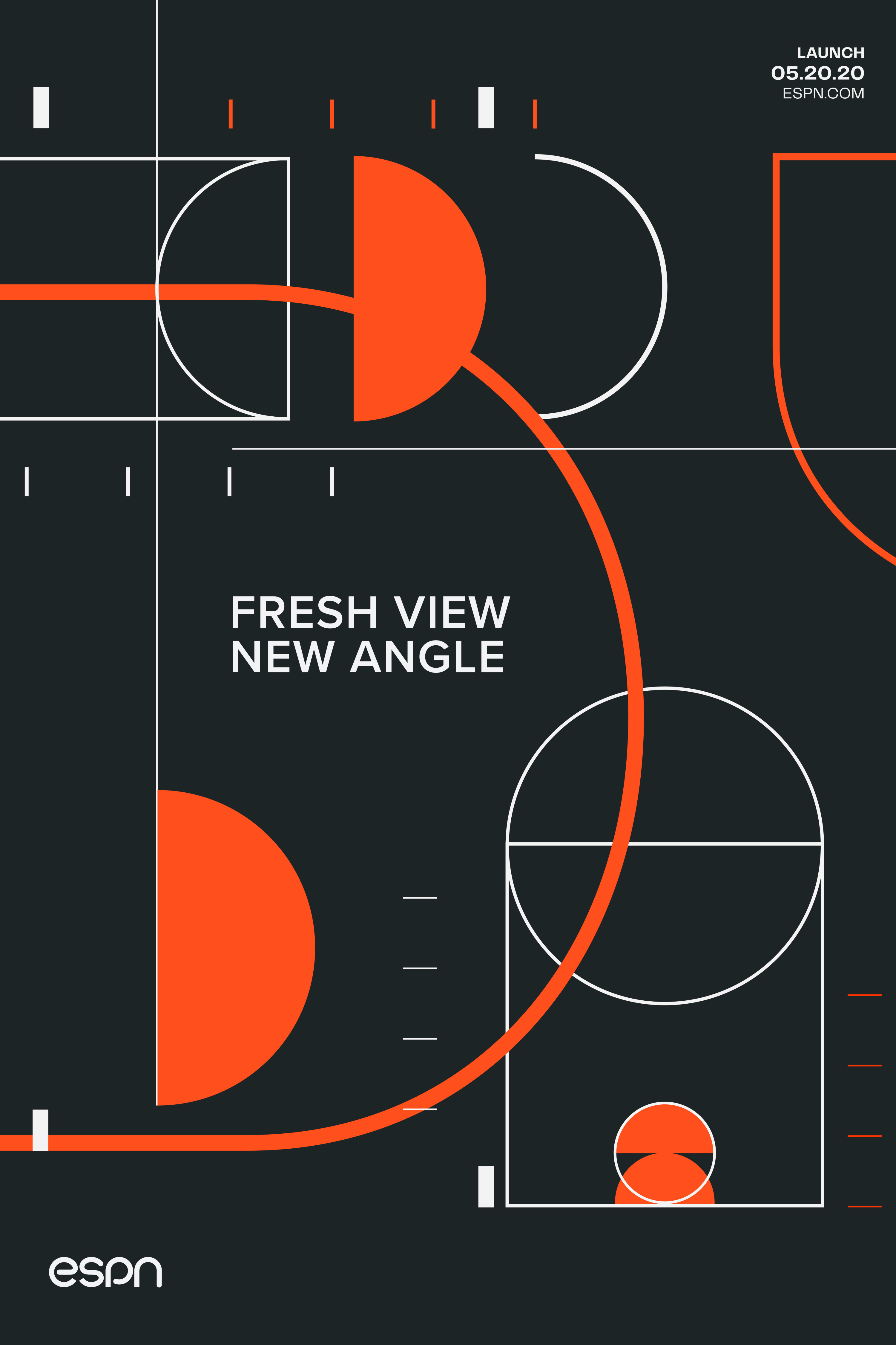
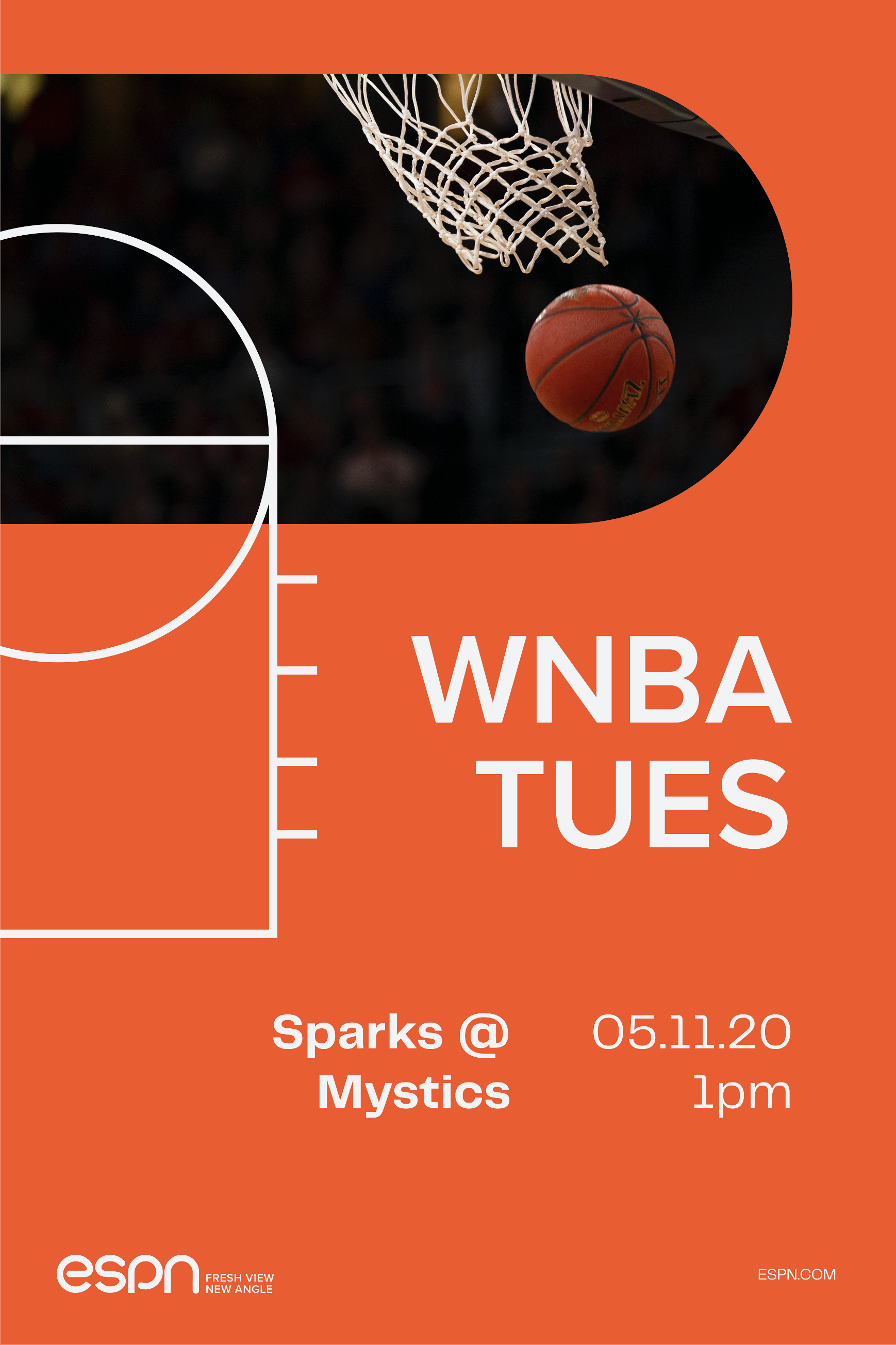
The graphic elements are abstract shapes and lines that make up different sports like basketball, baseball, tennis, hockey, and football.
The abstract shapes and lines of the brand language are used to construct yet deconstruct the rules of basketball, tennis, hockey, and baseball.
The circular forms and lines that create the logo communicate movement and energy for completion.
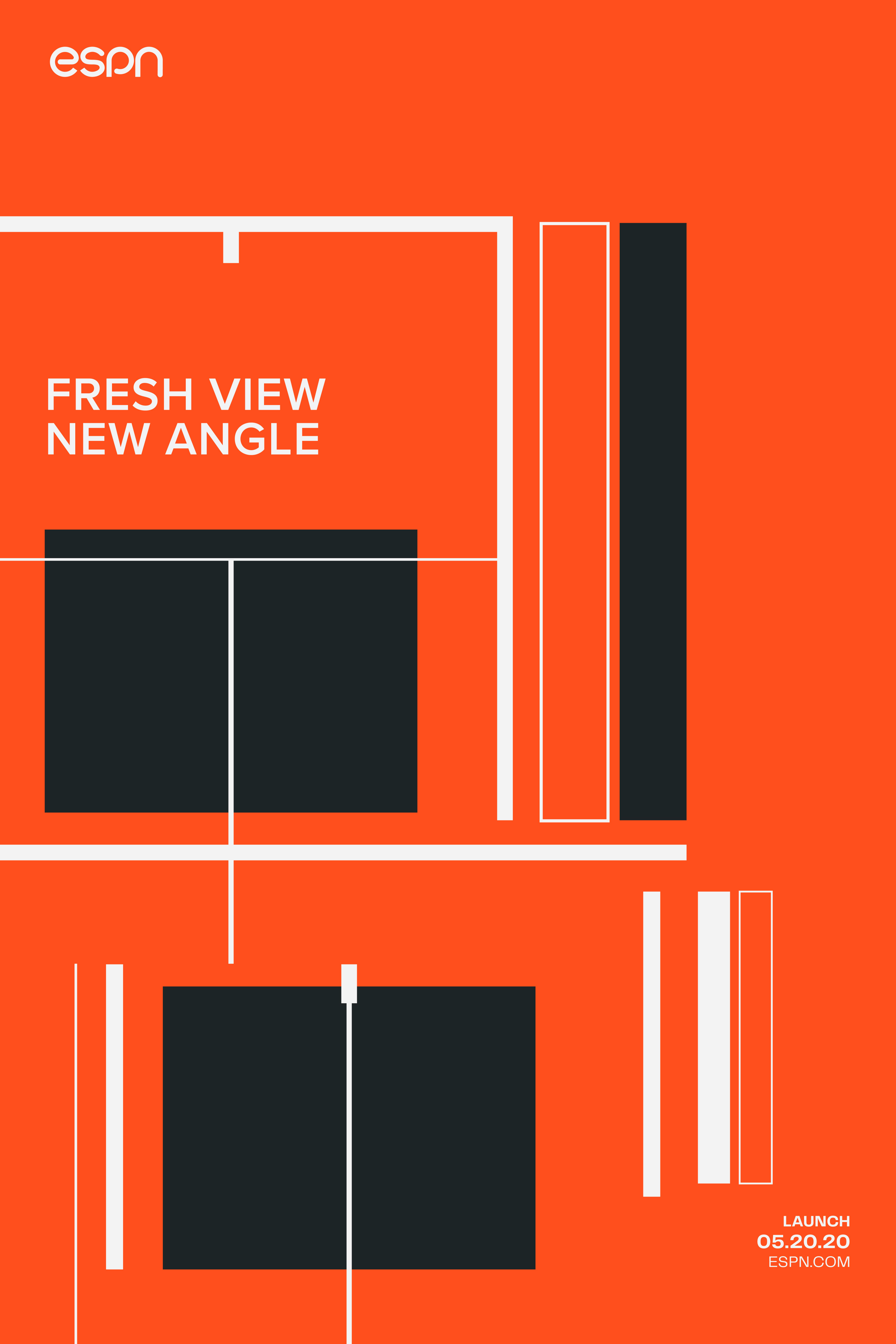
Broadcast On-Air Collaterals
With the brand language, the broadcast systems are used to emphasize the rules of sports for different programs.